


Using CSS and SCSS
Animation is something that fascinates people mostly frontend developers. I have noticed many people will see the transitions happening around websites and apps but at the same time they will also think that it would so much more difficult to create those animations and I agree with the point 😅. I will tell you why they never tried but today in this story I will make it easy for you. By the end of this story, I will ensure you are confident enough to write your animation.
What are Transitions? 😕

A transition occurs when an element changes from one state to another, and the browser fills in that state change with a sequence of in-between frames. It has a beginning and an end state.
We often see transitions used on hover states, or when information on a page is added or removed. The hover states might be a subtle change in font color, and information on the page might fade from invisible to visible. In simple words, I would say transitions are micro animations that make your website look advance and smooth at the same time.
Important Tips and Tricks
When we want to add a transition to any element of our website just add code this like **transition: 1s all** to the main class of elements. After this whatever property you want to change, change it in pseudo classes like **:hover, :active, :focus** , and Tada!!! 🥳 , you just wrote your first transition. Below I am also writing some examples for you in case you need some references.
let's write a CSS for the above animation you just looked at.
// this div has nothing to do with transitions.. please ignore it.
Hover ME!! Clickable Me!! Grow ME By Hovering
Here comes the CSS part, I want you to notice that just a few lines can do what changes in your website.
/* This class was added just for a proper view of buttons it has no relation to transitions */
.container { height: 90vh; display: flex; flex-direction: column; justify-content: space-around; align-items: center; }
.button-shape { border: none; background: red; padding: 10px 14px; border-radius: 10px; font-size: 14px; transition: all 500ms; }
.button-shape:hover { border: none; padding: 8px 10px; font-size: 16px; background: blue; border-radius: 40px; color: white; }
.clickable-button { border: none; background: cyan; padding: 10px 14px; border-radius: 10px; box-shadow: 2px 2px grey; transition: all 100ms; }
.clickable-button:active { box-shadow: none; opacity: 0.9; }
.expand-button { border: none; background: cyan; padding: 10px 14px; border-radius: 10px; transition: all 300ms; transform-origin: left; }
.expand-button:hover { transform: scaleX(1.5); box-shadow: 2px 2px grey; }
You can also see a demo here…
Not only this we can do a lot more with just transitions. I will be sharing my CodePen profile where you find more stuff. I can’t write all transitions here otherwise this will become lengthy and boring for you. Hope to see you there 😉.
Some definitions you should be aware of:
**Translate()**
The translate() method moves an element from its current position (according to the parameters given for the X-axis and the Y-axis).
Example
div { transform: rotate(20deg); }
**Rotate()**
The rotate() method rotates an element clockwise or counter-clockwise according to a given degree.
Example
div { transform: rotate(20deg); }
**Scale()**
The scale() method increases or decreases the size of an element (according to the parameters given for the width and height).
Example
div { transform: scale(2, 3); }
**ScaleY()**
The scaleY() method increases or decreases the height of an element.
Example
div { transform: scaleY(3); }
**ScaleX()**
The scaleX() method increases or decreases the width of an element.
Example
div {
transform: scaleX(2);
}
**Skew()**
The skew() method skews an element along the X and Y-axis by the given angles. Similarly, you can do for X and Y-axis with skewX() and skewY().
Example
div { transform: skew(20deg, 10deg); }
Now you are good to start the animation.
Excited!!!!
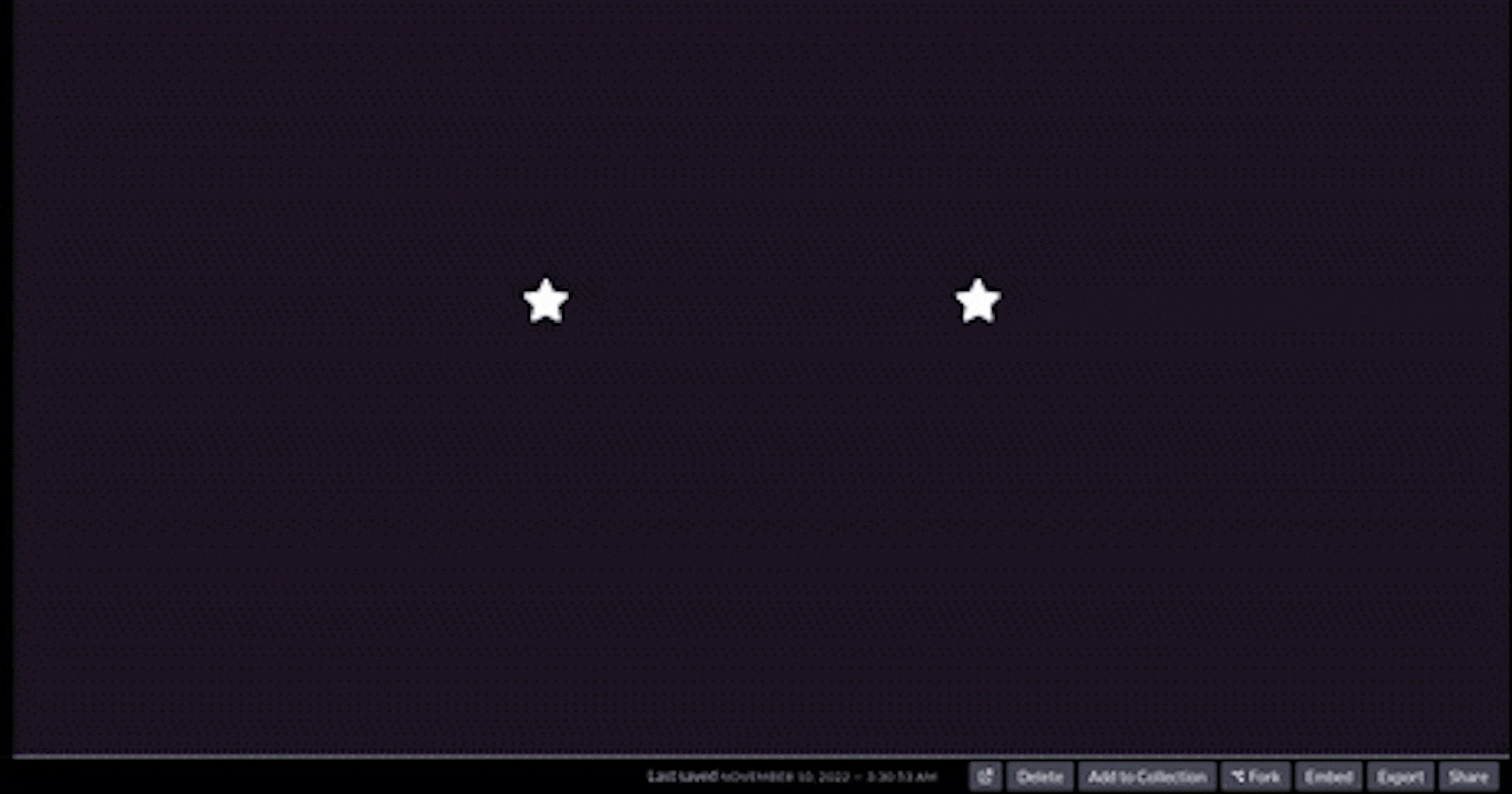
so first I will show you what we are going to write.
Now I will be showing the basic animation I wrote for you guys which will be interesting at the same time you gonna like it.
https://codepen.io/iamcyberster/pen/VwdPNmo
I have shared the link to the above animation wherein you can go play with it If enjoying it please consider liking it.
Explanation
So in the above animation, there are three things to notice.
Stars
Sky
Sun (most importantly)
Stars: In stars, there is a transition of its size it is growing and shrinking. To achieve this we have to use scale.
Sky: In Sky, a transition is changing the background color of the sky.
Sun: In Sun, we are moving it from bottom to top using translateY() which I have explained above.
[animation-delay](https://developer.mozilla.org/en-US/docs/Web/CSS/animation-delay)[animation-direction](https://developer.mozilla.org/en-US/docs/Web/CSS/animation-direction)[animation-duration](https://developer.mozilla.org/en-US/docs/Web/CSS/animation-duration)[animation-fill-mode](https://developer.mozilla.org/en-US/docs/Web/CSS/animation-fill-mode)[animation-iteration-count](https://developer.mozilla.org/en-US/docs/Web/CSS/animation-iteration-count)[animation-name](https://developer.mozilla.org/en-US/docs/Web/CSS/animation-name)[animation-play-state](https://developer.mozilla.org/en-US/docs/Web/CSS/animation-play-state)[animation-timing-function](https://developer.mozilla.org/en-US/docs/Web/CSS/animation-timing-function)
there are also other things that you can manipulate and enhance your animation.
Conclusion
So that's it for today. I am assuming that I may not have covered all the key concepts for advanced animation. But after reading the story you can write your animations for now at least. And if you want the animation to explain or any new animation you want me to explain in some article I will explain. If you have made it to this point please consider following it motivates me to write more.